

Beyond CGC Grade & Label
How small features can make a big difference to collectors
Many readers of the Collector Hub are intimately familiar with CGC grades and pricing. Generally speaking, knowing the grade and label of a book goes a long way in helping you acquire the issue—and even the particular copy—you want.
Nevertheless, subtle but important gaps separate how advanced collectors view comics compared to beginners.
Over time, many collectors discover that they are no longer simply buying comic books; they are learning to notice details that most people never see. Two copies may share the same issue, grade, and even page quality, yet one will be significantly more desirable than the other.
In this article, I'll focus on several of these often-overlooked features, ranging from page quality to a quirky characteristic of Hulk #181, Wolverine's first full appearance.
The Quirky Hulk 181 Characteristic
Page Quality
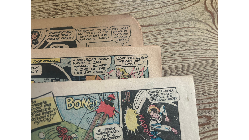
Among these features, perhaps the most obvious is page quality.
Prior to the 1990s, comic books were printed cheaply on paper that decomposes relatively quickly in less-than-ideal conditions. As a result, the pages of most vintage comics have aged to a darker color than their original white. Slight aging earns the Off-White-to-White designation by CGC, while the most severe deterioration results in Brittle pages, where pieces can break or flake off even with gentle handling.
Although grade is rarely affected by page quality except in the highest grades or most extreme deterioration, seasoned collectors often place significant emphasis on it. Some collectors, in fact, only pursue White-paged copies.
Varying Paper Quality
Of note, the older the comic book, the more difficult it is to find White pages. It's relatively easy to find White-paged copies from the 1970s, but extremely difficult for books from the 1930s and 1940s.
For example, I reviewed the roughly 25 distinct copies of Action Comics #1 (1938) sold through Heritage Auctions; only one copy boasts White pages.
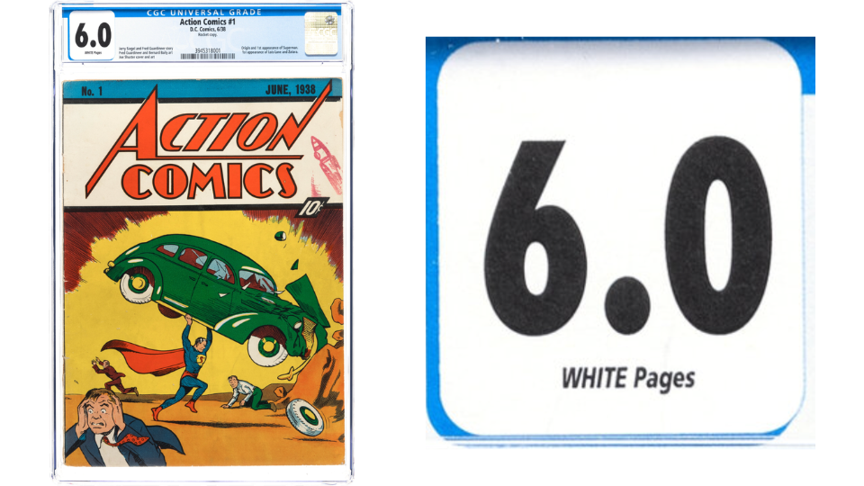
Action #1 Rocket Copy with White Pages Emphasized
Page quality is one of the first examples of a broader theme in advanced collecting: not all copies of the same book are truly equal.
Cover Color
Over a decade ago, when I first began serious collecting, I walked the floor of HeroesCon in Charlotte, North Carolina.
A buddy of mine—and a much more seasoned collector—pointed toward a dealer's booth and said, "Keston, look at those two copies of X-Men #1. What do you see?"
It was obvious that one copy had bright, dark, vibrant colors while the other looked dull and muted.
Upon closer inspection, both books were labeled Very Good / Fine.
"Which one would you want?" he asked.
Obviously, the one with vibrant colors.
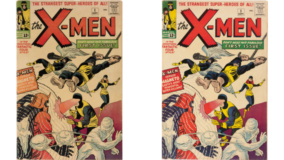
X-Men #1s: Same Grade, Different Color Quality
The vibrancy and richness of cover colors can be affected by many factors: wear, exposure to sunlight, storage conditions, and even production quality. Some publishers were notoriously inconsistent, with certain copies leaving the printing press with much stronger color strike than others.
This is probably the feature that affects my buying decisions the most.
I'll happily pay toward the top end of GPA for a book with exceptional color. On the other hand, I'll pay significantly less—or pass entirely—on a dull copy.
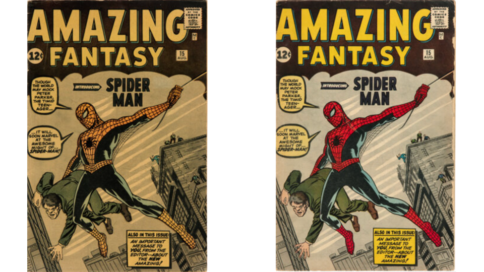
Amazing Fantasy #15s: Same Grade, Different Color Quality
This is one area where experienced collectors often outperform novices. A newer collector may pay GPA average for a dull copy and later struggle to find buyers at the same level. A seasoned collector understands that eye appeal matters and that a beautiful copy often proves easier to sell.
Beyond the financial side, I simply enjoy owning books with great color. Rich, vibrant covers remind me of the excitement of spotting a comic on a newsstand and anticipating the adventure waiting inside.
Stamps and Writing on Cover
There are at least two cases where writing on a comic book is typically—though not always—preferred: creator signatures and some pedigree copies.
In each case, CGC recognizes the distinction through a special label. Signature Series books receive a yellow label while pedigree copies receive a gold label. Depending on the pedigree or signatory involved, these copies often command substantial premiums.
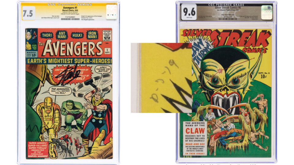
Signature Series and Pedigree Copies Usually Sell for More
What I'd like to highlight, however, are markings that do not receive special label treatment.
These features tend to be highly polarizing. Some collectors pay premiums for them while others avoid them entirely.
In my experience, Golden Age collectors are often the most appreciative of such markings. They can help identify a specific copy, establish provenance, or simply give a comic more personality.
Consider the Rocket Copy of Action Comics #1. Not only does it have White pages, but it is also instantly recognizable because of its famous stamp.
Some books even participated in history.
During the lengthy litigation in which DC alleged that Captain Marvel was a Superman imitation, various comic books were submitted as evidence. Certain surviving copies still bear markings from those proceedings.
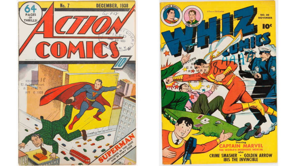
Court Copies of Action #7 and Whiz #80
These books also illustrate another subtle point: placement matters.
The person who stamped Action #7 appears to have had a good eye for composition. Poor Captain Marvel, on the other hand, received considerably less respect on the Whiz #80 copy.
One of my favorite examples comes from World War II veteran Robert "Buddy" Boone.
I interviewed his grandson, who explained that many of Mr. Boone's childhood comics had “Robert Boone” or "Buddy" written on the cover. Comic historian Gary Carter later told me that such writing was common because children frequently exchanged comics. Writing your name on the cover increased the chances of getting the book back.
While the Boone Collection may not be famous, I enjoy the reminder that these books belonged to a real child decades ago.
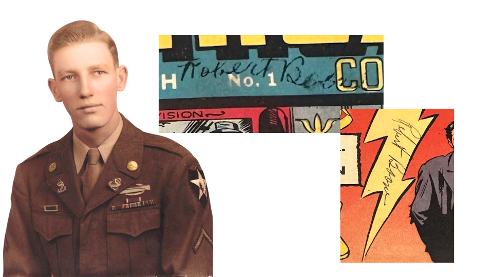
Robert “Buddy” Boone Signed His Comics to Get Them Back
Date stamps are another example. Distributors often stamped comic covers with dates corresponding to when they would first appear on newsstands. Retailers used these dates to identify unsold copies that could be returned for partial credit.
Interestingly, the stamped dates often precede the cover date by weeks or even months.
My friend and frequent collaborator Ben Labonog has a strong preference for date-stamped copies. He relayed to me, “Full date stamps (e.g., AUG 31, 1939) are a small window into a comic book’s…life span…[they are] a time capsule of goodness.”
The Well-Produced Copy
You've probably heard the phrase "no expense was spared."
Well, when it came to comic-book production from the 1930s through at least the 1970s, expenses were often spared with reckless abandon.
As a result, production variability was rampant.
Some books were miswrapped. Dull cutting blades produced Marvel chipping. Staples were occasionally placed slightly off the spine. Covers could be miscentered, and some books emerged from production looking closer to a parallelogram than a rectangle.
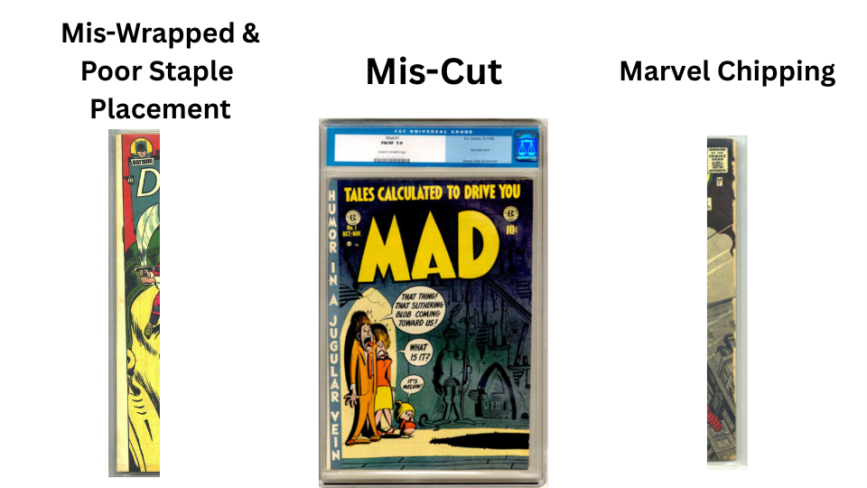
Examples of Production Defects
One notable defect is off-register inks, where overlapping colors fail to align properly during printing. The result can make artwork appear blurry or slightly doubled. The majority of Marvel Comics #1—the first-ever Marvel comic book and first appearance of the Human Torch—appear to suffer from this defect.
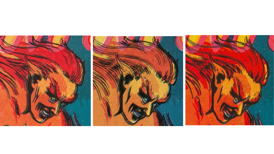
Bad to Good Registration for Marvel #1
Yet amidst all that variability, some copies came out beautifully.
We’ll call these "well-produced copies," and the best examples can command meaningful premiums.
For example, I once heard of a collector who traded his Amazing Spider-Man #129 (the first Punisher appearance) in CGC 9.8 plus several thousand dollars for another Amazing Spider-Man #129 in CGC 9.8 simply because the second copy had slightly better centering.
To many people, that sounds absurd. To a collector who has spent years studying copies of the same book, it makes perfect sense.
Cover Art Optimization
There's a subcategory of production variation that I particularly enjoy. I call it cover art optimization.
Depending on how a comic was cut and wrapped during production, the cover image can shift slightly up, down, left, or right. As a result, different copies reveal different portions of the artwork.
Sometimes no copy perfectly captures the complete image.
Collectors often hunt for copies that preserve especially desirable details.
Three well-known examples are the quotation marks after "Iron Man" on Tales of Suspense #39, the full big toe on Hulk #1, and the complete cigarette cherry on Chamber of Chills #22.
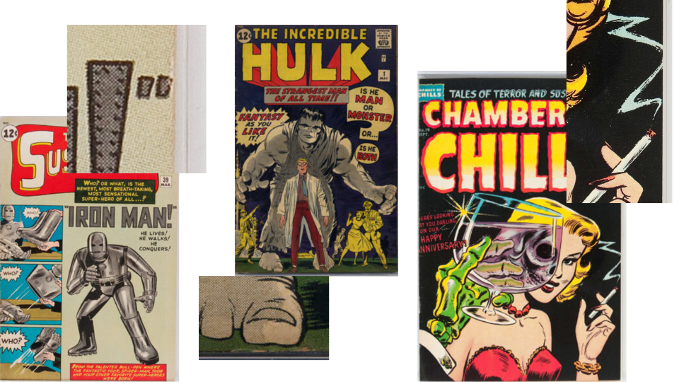
Desirable and Difficult to Find Art Details
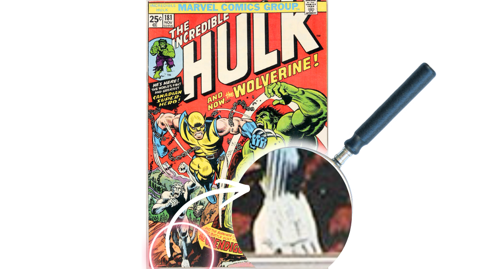
My latest obsession has been a side quest that's a bit less traveled.
I was hanging out with Ben Labonog and noticed a Hulk #181 poster on his wall. Hulk and Wolverine dominate the cover, but behind them lurks the Wendigo.
What caught my eye was Wendigo's left foot. It was severely cut off. I became curious about how that foot appeared on other copies.
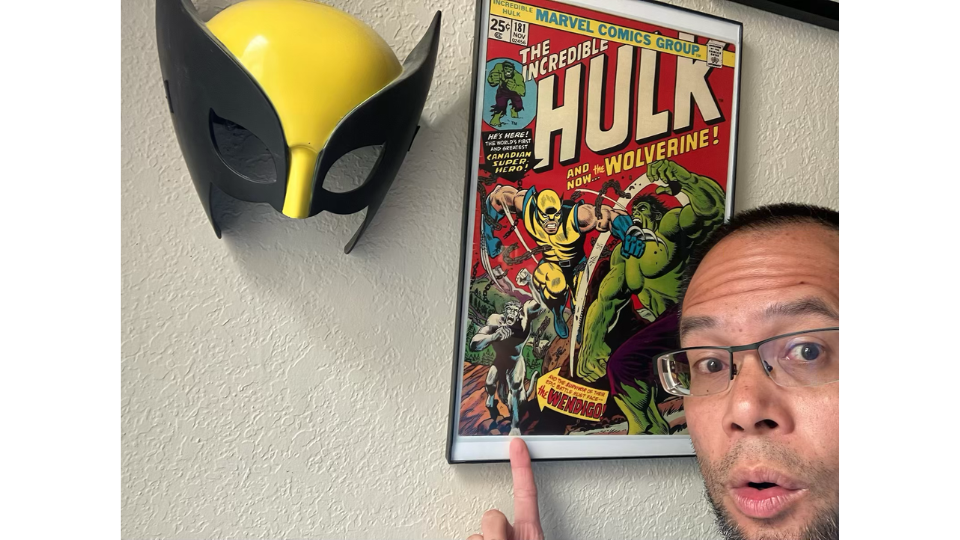
Ben Labonog and His Poster of Hulk #181
I checked Heritage Auctions' archives and quickly noticed considerable variation. Some copies lost almost the entire foot. Others revealed substantially more. None appeared close to complete.
Then I committed. I reviewed approximately 1,000 copies of Hulk #181 that Heritage had sold and began categorizing them.
Several hours later, I had my answer.
Level 5 represented a complete foot with full toes. I never found one.
What I did discover was that three percent of copies exist with visible toe knuckles (Level 4) and even a gap separating the big toe (Level 4.5). The latter appears to be exceptionally difficult to find (0.3%).

Keston’s Wendigo Toe Scale!
Here's what's fun about side quests like this.
You can take almost any vintage comic book and examine every copy you can find. Eventually you'll notice details that most collectors overlook. Some of those details may command premiums. Others may not.
But the real reward is something else entirely.
The longer collectors stay in this hobby, the less they focus on the number on the label and the more they focus on the individual copy itself. Two comics may share the same issue, grade, and page quality, yet one stands apart because of its colors, provenance, centering, production quirks, or even a tiny detail like Wendigo's foot.
Learning to see those differences is part of what transforms collecting from accumulation into connoisseurship.
If you would like to learn more, check out related videos on my YouTube channel!
Searching for Wendigo’s Foot: https://youtu.be/R8iT0LUk7OQ
Buddy Boone’s Collection (including Cap #1!): https://youtu.be/ynmPhil2Qxc
Beyond Grade Interview with Matt Nelson: https://youtu.be/28TkWxlQpyU
Acknowledgements
All images of comic books, with exceptions listed below, are from Heritage Auctions (HA.com).
Image of Robert “Buddy” Boone and his comics courtesy of his grandson.
Image of Ben and Hulk 181 poster courtesy of Ben Labonog.
The image of the paper quality is my own.