

Inked Realms 001: Lines That Speak


Graphic novels don’t whisper; they shout in image. Before a word is spoken, a single line, a splash of colour, or the tilt of a panel tells us what kind of world we’re stepping into. Visual style isn’t decoration; it’s the medium’s soul. Every choice — line weight, colour palette, composition, exaggeration or restraint — becomes a voice. Some boom, some whisper, some drift like music. To see how style defines comics, let’s explore five styles —five voices that didn’t just draw, but redefined how we perceive the art form.
Inked Realms series:
Part One: Inked Realms 001: Lines That Speak
Part Two: Inked Realms 002: Rhythms on the Page
Part Three: Inked Realms 003: Worlds That Breathe
Lines That Breathe
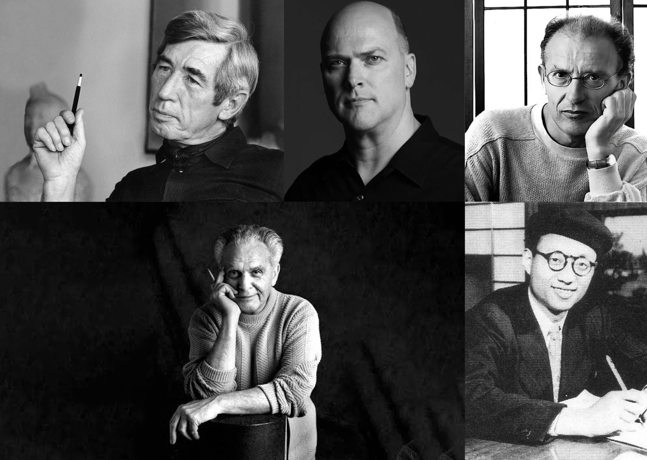
Comics live in the tension between limits and liberation. The page is fixed, the panels are static, the images don’t move — and yet, within those constraints, artists find infinite ways to make drawings breathe. Hergé gave us clarity through the clear line, Kirby exploded with exaggeration, Moebius whispered with restraint, Tezuka flowed like cinema, and Ross painted with realism. Each offered a different answer to the same impossible question: how do you make still images tell a living story?
That’s why visual style matters. It isn’t decoration — it’s the medium’s soul. Every line drawn, every colour choice, every way the eye is led across a page doesn’t just shape how we see comics, but how we feel them. A panel can shout with chaos or whisper with silence. A colour can heighten joy, dread, or melancholy before a single word appears. Style is the current that pulls us through the story, often invisibly, yet always unmistakably.
The Creative Lens
Creating a comic's visual style is about far more than how characters are drawn — it's about crafting a visual language that sets the tempo of the entire story. Think of it like music. Every page is a score, every line a note, every panel a measure of rhythm. The artist isn't just drawing pictures; they're conducting an orchestra of images, deciding where the crescendo hits and where the silence lingers.
When approaching a page, an artist asks themselves:
What does this moment feel like? A whisper, a clash of cymbals, a slow build, or a sudden drop?
Where should the eye land first? Does a hand reaching out dominate the page, or do we lead with the vast emptiness of a city skyline?
How long should the reader linger? A splash page makes them stop and stare; a row of tiny panels makes them race.
What mood should colour and texture create? Neon vibrancy can scream energy, while muted tones can hum with melancholy.
It's equal parts instinct and discipline. Some days it's about raw energy — rough sketches that spill across the page until the right rhythm emerges. On other days, it's meticulous: refining panel borders, adjusting negative space, and redrawing a gesture until it sings. The artist isn't just choosing between thick or thin lines, bold primaries or soft pastels — they're selecting the mood of the story itself.
Masters of the Page
Once a visual style settles in, it becomes the voice of the comic. Hergé’s crisp clarity, Kirby’s explosive dynamism, Tezuka’s cinematic flow, Moebius’s dreamlike surrealism, Ross’s painterly realism — each isn’t just a look, but a score. A drawn world where every stroke is a decision about atmosphere, pace, and emotion.
Jack Kirby: Explosions on the Page


Kirby's art is all about energy in motion. His figures are bold, often anatomically impossible — huge fists foreshortened into the foreground, bodies twisting like coiled springs. Critics sometimes call it "cartoonish," but that misses the point: Kirby wasn't aiming for realism; he was aiming for impact.
Technically, his style leaned on heavy contour lines, stark black-and-white contrasts, and aggressive use of perspective. His signature "Kirby Krackle" — those clusters of black dots swirling around cosmic blasts — is pure graphic design: an abstract shorthand for raw power. Remarkably, such a simple device could feel so alive. Still, it does, because Kirby understood something essential about comics: suggestion is often stronger than simulation.
Kirby also pushed against the page's limitations. His two-page spreads disrupted the rhythm of panel-to-panel storytelling, forcing readers to pause and absorb a moment of grandeur. It was a way of saying, "Look, this is bigger than the story — this is spectacle." He turned flat pages into windows onto the infinite.


Pages of Power
Top 5 notable issues showcasing Kirby’s explosive visual dynamism:
Fantastic Four #1 (1962) – The birth of Marvel’s visual energy, bold anatomy, and dynamic page layouts.
Thor (Journey Into Mystery #83 onwards) – Kirby’s mythic splash pages and godlike designs shine.
New Gods #1 (1971) – Invention of epic cosmic landscapes and powerful characters like Darkseid.
Mister Miracle #1 (1971) – A showcase of Kirby’s layout bravura, dynamic form, and creative invention.
Fantastic Four Annual #6 (1968) – Explosive cosmic action and classic “Kirby Krackle” energy.
Moebius: Dreams in Clean Lines
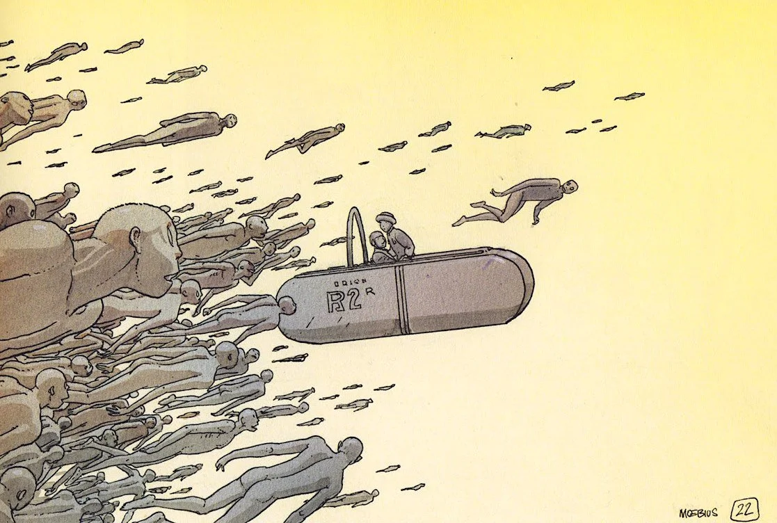
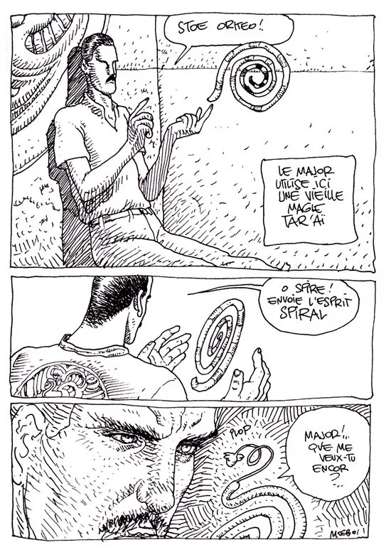
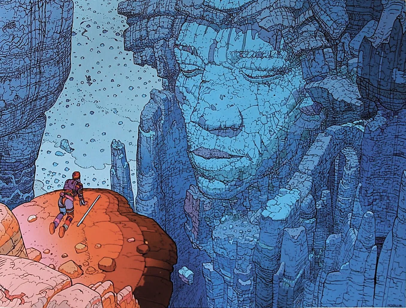
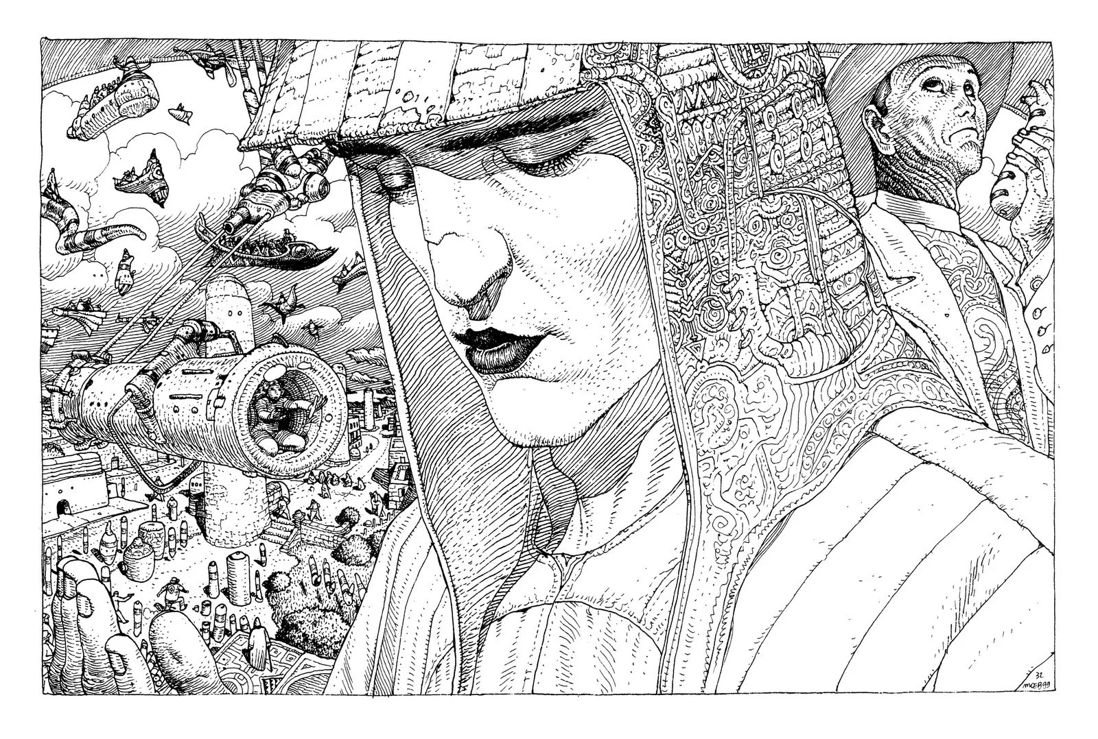

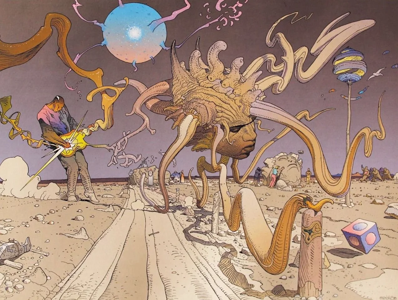
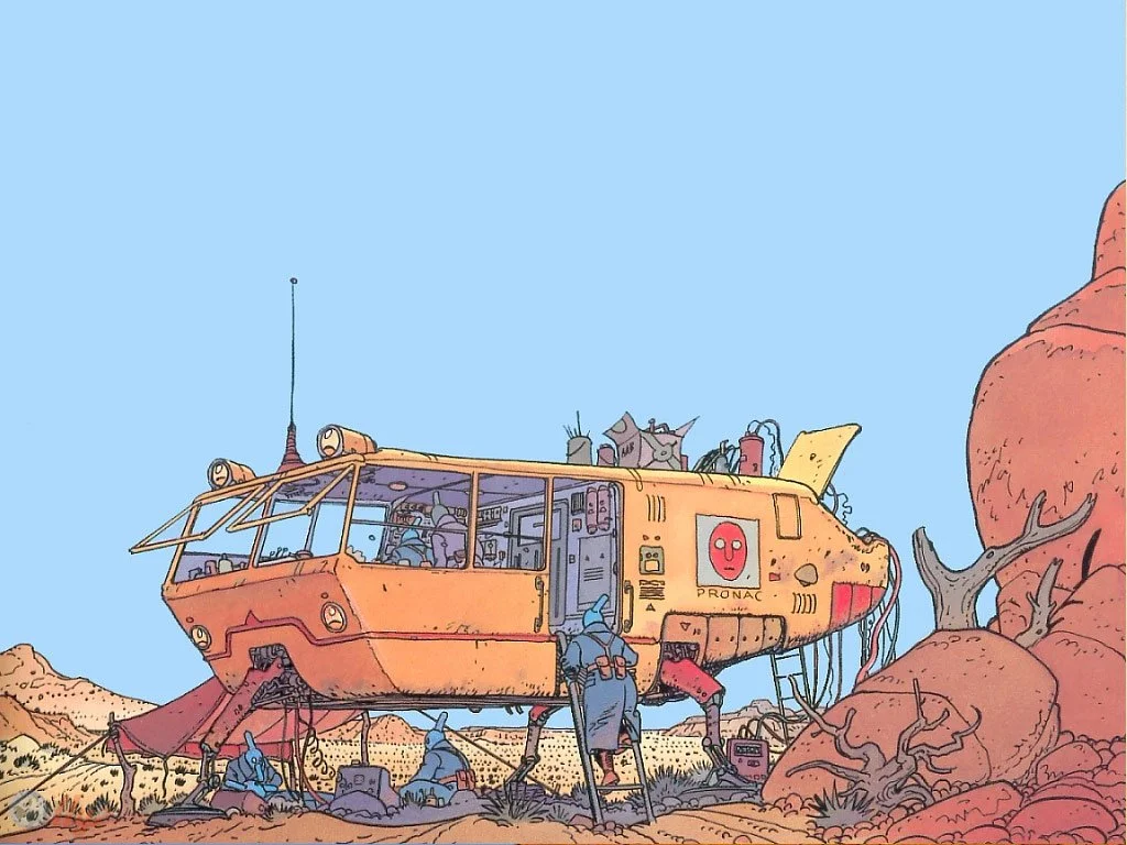
Where Kirby thundered, Moebius whispered. His work is defined by ligne claire — clean, unbroken linework with minimal hatching. The restraint is almost architectural, giving his surreal worlds a clarity that makes the impossible believable.
Technically, Moebius leaned on subtle colour palettes, airy negative space, and a meticulous balance between simplicity and detail. His line was never cluttered; instead, it carried an elegance that allowed alien landscapes and strange characters to feel grounded.
What makes his art form special is the way it invites wandering. You don't race through a Moebius page; you drift. His panels breathe. Where superhero comics often pull you forward with velocity, Moebius lets you stop, stare, and even get lost. That's a different kind of power — the ability to make stillness compelling.
Moebius proved that comics could embody fine art principles, including composition, rhythm, and clarity of line. He expanded the medium by showing that restraint can be as powerful as excess.


Lines of Infinity
Top 5 Works Revealing Moebius’s Surreal Clarity and Dreamlike Worlds
Arzach (1975) – Wordless storytelling through clean lines, surreal imagery, and meditative pacing.
The Airtight Garage of Jerry Cornelius (1976–79) – Fluid, non-linear, and highly imaginative layouts.
The Incal (1980–85) – Deeply imaginative sci-fi worlds drawn with clarity and depth.
The Long Tomorrow – Early conceptual work that influenced cyberpunk’s visual language.
Metabarons or Silver Surfer: Parable (1988–89) – Mythic space opera fused with philosophical depth.
Osamu Tezuka: Cinema in Panels


Tezuka was the God of Manga, not only because of his characters but because he taught manga how to move. His visual style drew from animation — soft, rounded forms and large, expressive eyes — but his genius lay in panel composition. He treated the comic page like a film reel, with close-ups, jump cuts, tracking shots, and dramatic shifts in perspective.
This was a technical breakthrough. Instead of a rigid grid, Tezuka used panel size and shape to manipulate time: a wide panel to establish space, a narrow one to suggest speed, a close-up to freeze emotion. Readers didn't just see the story — they felt it unfold like a movie.
Manga also had the advantage (and challenge) of space. While American comics were confined to 20-odd pages per month, manga could run for hundreds of pages. Tezuka embraced this, pioneering a decompressed style in which a single glance or gesture might span multiple panels. What might be dismissed as "slow" in the West became a tool for emotional depth in Japan. He showed that comics aren't just about what happens — they're about how long you live inside a moment.


Frames of Life
Top 5 Stories Demonstrating Tezuka’s Cinematic Flow and Expressive Simplicity
New Treasure Island (1947) – Early manga with experimental panels and cinematic pacing.
Astro Boy – Expression-first character design and dynamic storytelling pace.
Black Jack – A mature design palette paired with emotionally grounded visuals.
Phoenix (various arcs) – Visual versatility ranging from ancient myth to dystopian future.
Metropolis – Rich period detail and moody visuals blending manga and cinema.
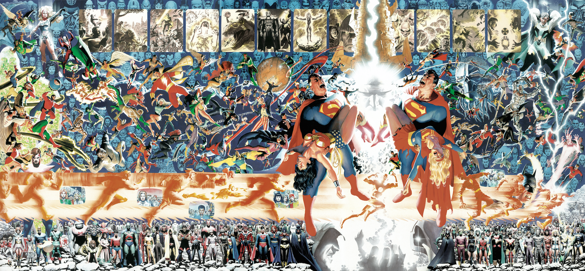
Alex Ross: Heroes Made Flesh


Ross represents a different revolution: the return to realism. Where Kirby's anatomy exaggerated power and Tezuka's softened faces exaggerated emotion, Ross painted superheroes as if they were sitting for portraits in a museum.
His technique is rooted in gouache and watercolour, where he layers colours to achieve lifelike texture and light. Capes fold like real fabric. Skin tones carry warmth and age. Batman's armour looks heavy enough to drag him down. This isn't line art coloured flatly; it's an illustration of the highest level of fine art.
By doing this, Ross challenges one of comics' limitations — the tendency to flatten reality into symbols. He reintroduces weight, texture, and gravity. And yet, he never loses the myth. His Superman still radiates awe, his Wonder Woman still stands impossibly tall. The realism doesn't diminish their legend; it magnifies it, reminding us that myths are most potent when they feel close enough to touch.


Painted Myths
Top 5 Works Highlighting Ross’s Realist Gravitas and Monumental Storytelling
Marvels (1994) – Lush painted realism that redefined how we see superheroes in everyday settings.
Kingdom Come (1996) – A weathered, mythic Superman and epic painterly scope.
Terminator: The Burning Earth – Ross’s debut in full-painted sequential storytelling.
Iconic Covers (Justice, Avengers Assemble, etc.) – Hyper-realism in emotionally charged portraits.
Various DC & Marvel Painted Covers – Elevating superhero mythos to gallery-worthy art.
Hergé: The Clear Line of Europe


Hergé’s art is characterised by its clarity. Known for pioneering the ligne claire (“clear line”) style, his panels were precise, balanced, and immediately readable. Bold outlines contained flat, even colours; shadows were minimal; detail was used sparingly but with purpose. The result was visual storytelling that felt both accessible and elegant — every object, figure, and background cleanly rendered, even in the busiest scenes.
What makes Hergé remarkable is the tension between simplicity and realism. His characters — from Tintin to Captain Haddock — are stylised and cartoony, yet they inhabit meticulously researched environments. Vehicles, architecture, landscapes, and even clothing were drawn with near-journalistic accuracy. A plane looked like a real plane, a bazaar like a real bazaar, a city like a real city. This grounding allowed readers to believe in the adventure, no matter how fantastical it became.
Technically, Hergé’s approach was less about exaggeration or flourish than about lucidity. Every line had purpose; every panel was a study in readability. He proved that comics didn’t need distortion or painterly depth to be powerful. Instead, he demonstrated that clarity itself could be a style, transforming the page into a window where the story flows without distraction.


Clear Lines of Adventure
Top 5 notable works showcasing Hergé’s visual clarity and timeless storytelling:
Tintin in the Land of the Soviets (1929–30) – The first Tintin story, rough but the birth of Hergé’s clear line.
The Blue Lotus (1936) – A breakthrough in artistic maturity and cultural authenticity, blending clean style with richly researched environments.
The Secret of the Unicorn (1943) – A showcase of visual clarity in action sequences and intricate treasure-hunt settings.
Explorers on the Moon (1954) – Bold scientific accuracy paired with clean-lined futurism, making space exploration both believable and adventurous.
Tintin in Tibet (1960) – Striking landscapes and restrained use of colour create one of Hergé’s most emotional and visually atmospheric works.
Next up: Rhythms on the Page
Visual style is the first voice of comics. Lines, colours, and composition set the tone before a single word appears, reminding us that comics aren’t just stories with pictures — they are pictures that are the story.
But visuals are only half the magic. In the next part of this series, we’ll explore how comics control time and rhythm through storytelling — how pacing, panelling, and narrative choices turn static images into living, breathing experiences.
Because if visual style is how comics look, storytelling is how they move.